Cut-out Animation
This is brief tutorial to show how create cut-out style animations. Usually cut-out style animations use image art instead of vector art to create the animation. See South Park series. You should obtain some kind of animation like this one:
Contents
Preparing the material
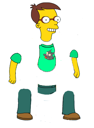
For a cut out animation you'll need some images that represent the moving parts of the animation. For this example I've prepared a Simpsons like boy. You can take the images from this file. It also has the final sifz animation result.
Each part of the body (head, arms, legs, etc.) is a single PNG file. (In the split image, the individual images are composited in a bigger one). I've set all the files to have the same horizontal and vertical dimensions so all the images can fit one over the other to create the character without the need to adjust their sizes or positions. It will help later to import each image into Synfig.
|
Directly in SynfigStudio Take a look to the Cutout Tool. A special tool to easily select a piece of a composition by adding a mask.
|
Importing the cut out images
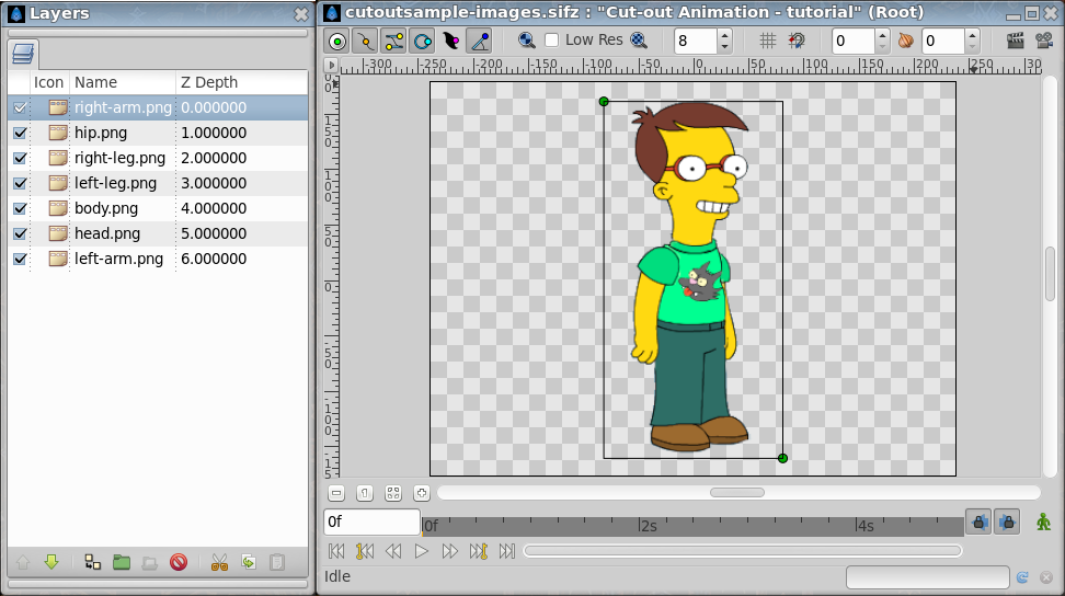
This is as simple as going to the Caret Menu and selecting File->Import and the proper file for each part of the character. After repeating this process for each of the image files of your character you should obtain what is shown below:
When you do the tutorial you'll notice that all the image layers have the same dimensions. The boundary of each image layer is the rectangle with the green handles shown. The bounding boxes of all the layers coincide since I expressly created each image with those dimensions and properly placed. It will allow us to do the following: Select all the layers (Ctrl + click each layer in the layer list) and go to the Top-Left and Bottom-Right parameters (they get greyed) in the parameter list. Make right-click -> Link on each one of the Top-Left, Bottom-Right parameter. It will link all the boundaries of the image layers to maintain them at the same relative position. This will prevent any accidental modification of the image edges and subsequently avoid any improper image deformation.
Obviously the layer order is important to place each part of the character to compose it properly (in this case the left leg is behind the right one).
Group the image layers
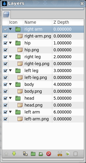
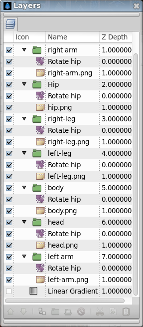
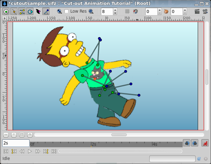
As you can imagine we are going to use Rotate Layers to perform the cut out animation. But before apply the rotation for each part of the character, we need to group it so that the rotation only applies to the desired layers. After grouping and renaming the group layers, it looks like this:
Add the Rotate Layers
Before adding the Rotate Layers you should have analysed your character. You need to have figured out the mechanical framework which the character's movements are bound by, the mechanics of the character's skeleton. For a simple humanoid character one considers the hip as the center of the rotation of the whole skeleton. Each limb rotates relative to the hip's rotation. Also each sub-limb should rotate relative to its parent and the parent relative to the hip (we use the hip as the root bone).
In our current example, the body will rotate relative to the hip and the head relative to the body. When the character's hip is rotated there needs to be an identical rotation of the body. The head needs to rotate with the torso and additionally with the hip. This cummulative effect of rotating limbs and sub-limbs is known as the limb hierarchy. The head also needs its own individual rotation which won't affect any other limb.
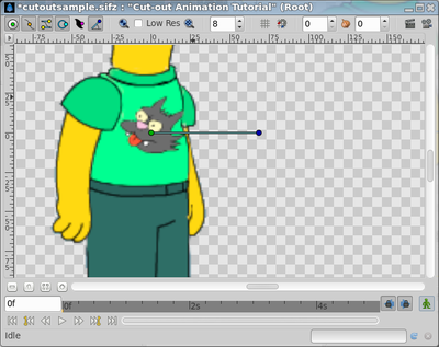
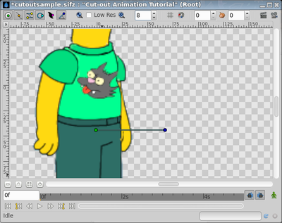
Let's start by adding a Rotate Layer to the hip. Go to the hip group layer and select the hip image layer. Insert a new Rotate layer (File->Layer->New Layer->Transform->Rotate) just above the hip image layer. Rename the layer to 'Rotate hip'. Now go to the Rotate Layer parameters dialog and select the Amount parameter. This parameter governs the angle of rotation. Export that parameter (right click) and give a proper name (hip).
Now to set up the rotation layer. You should have noticed that there is a Origin parameter in the Rotation Layer, this is the origin of the rotation. It is very important that you set the origin to the proper position, allowing proper rotation of the image layers, so in this case you need to place the origin of rotation at the center of the character's hips. As another important example, arms will rotate about the shoulder and not about the hand.
| Before | After |
| Now consider our reasoning: When the character's hip is rotated there needs to be an identical rotation of the body. The head needs to rotate the with the torso and additionally with the hip. Another way to put this would be that each limb bears it's own rotation, plus the rotations of those limbs higher up the limb hierachy. To effect this you should add the same rotation layer to all the limbs that depend on the hip rotation. Copy and paste the Rotate hip layer to all the grouped image layers. Remember that the rotation parameter is exported, and so will the value shared between all the pasted rotation layers, giving our desired effect. All the limbs will now rotate in congruently with the hip. Magic! See the image. |
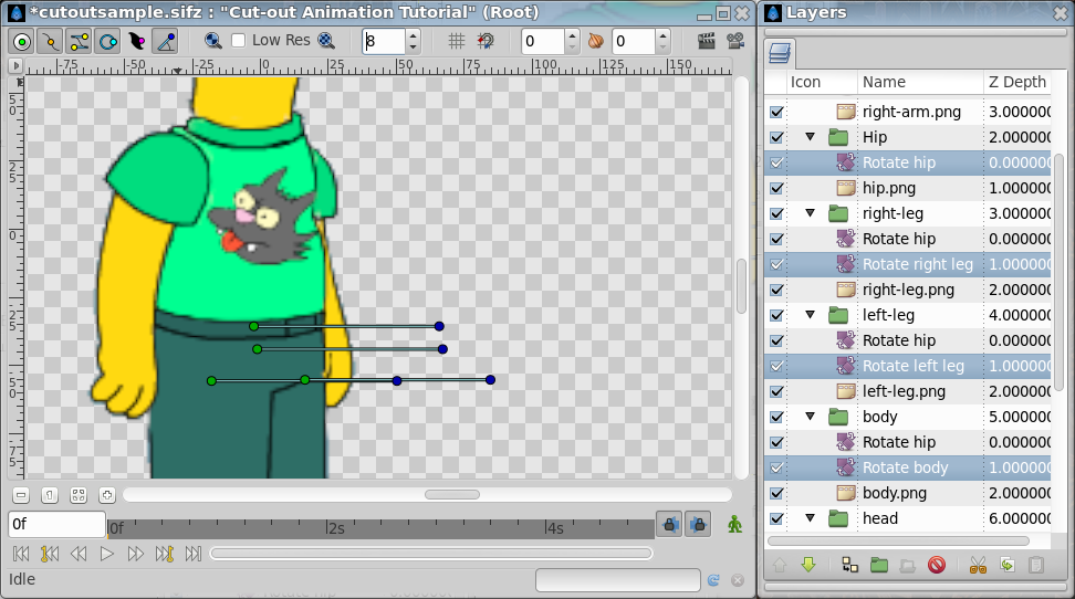
For each next level limbs we need an additional individual Rotation Layer. The next level limbs are: the legs and the body. We need to add a Rotation Layer for each next level limb. You should repeat the same process for each one: Add the Rotate Layer, rename it, export the Amount parameter (very important) and place Origin to the proper rotation place.
After doing that for the legs and for the body you should obtain something like this:
Notice that fortunately you have exported the Amount parameter for each added rotation layer. So all the copies of the Rotate hip layer share the same rotation. The same applies to the other rotation layers (body and legs).
Since the arms and the head are children limbs of the body they should suffer the same rotation as the body. Repeat the same for the body rotation layer and copy it over the arms and the head image layers.
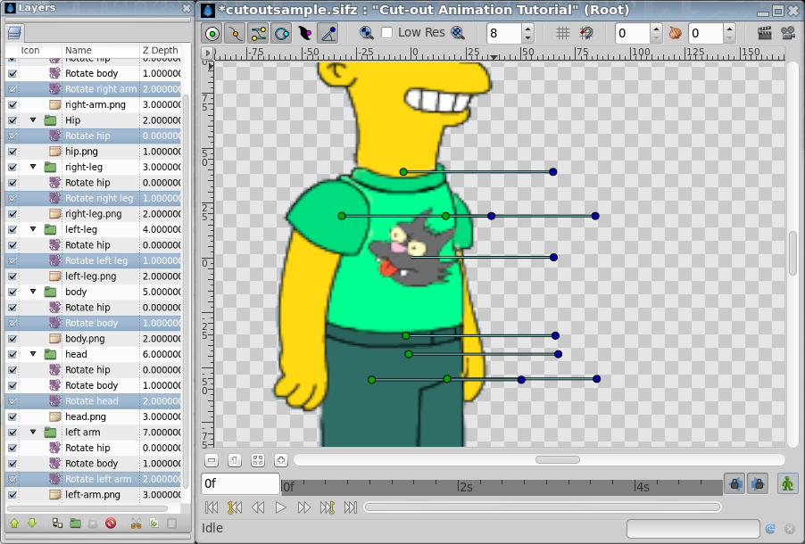
Now you can imagine how this works. You need now an additional rotation layer for the rest of the limbs to produce its individual rotation. So repeat the steps of Add a Rotate Layer, rename it, export the Amount parameter and center the Origin. You should obtain something like this:
Now animate it!
It is time to animate the character!. You can go to the Library Panel and expand the ValueBase Nodes and select any of the already exported parameters (angles). Alternatively you can select the parameter itself from the proper layer. It will set the angle handle at the proper position showing the altered position and angle due to the nested rotations performed for each sub-limb. You can do use of the Set feature of Synfig to select multiple scattered layers with only one double click.
Don't move the origin of any layer! If you do, you will break the composition.
Notice that I've prepared the individual images with a rounded hidden area (look again at the split character image and see what I mean). This allows us to make rotations without revealing sharp corners.
Tips & Tricks
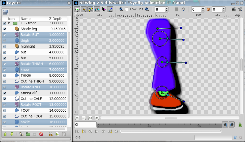
Herb, in the forum, give a "Ball joint style construction". It's a simple solution to mask the lines of two intersecting shapes. You can use a circle of same color, not a region or outline layer. The circle must cover intersecting lines and be above (z) both shapes in layers. Rotation handles origins are close to origins of the circles. Linking them are optional and needs some tweaking of position when done. Here is a leg Herb had construct using this method.
For alternative set-ups and its pros and cons, see the talk page.

