Blend Method Parameter
The various compositing methods available for Layers in Synfig. (What compositing/blending is.)
By default, "Blend Method" parameter is "Static". To animate it over the time, right click on it and choose "Enable animation".
In the following descriptions, 'A' refers to the color on the layer with the blend method setting, and 'B' refers to the color on the layers beneath it. Note that in almost all layers, the alpha channel of the colors will have a scaling effect on the blending. The 'amount' parameter will also have a scaling effect. In most descriptions these 2 details have been glossed over.
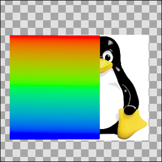
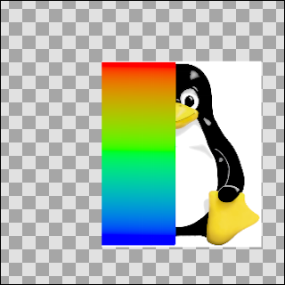
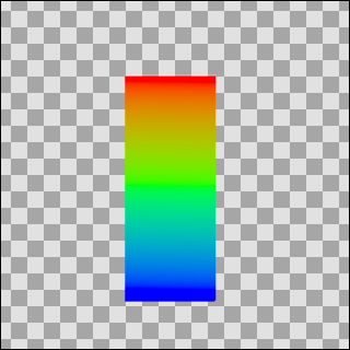
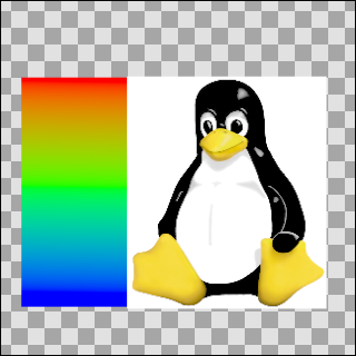
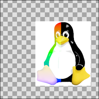
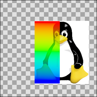
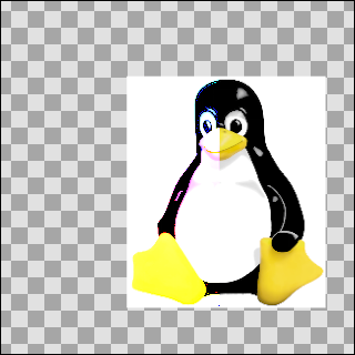
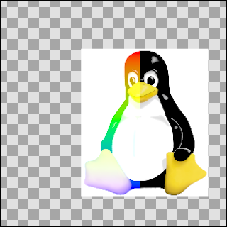
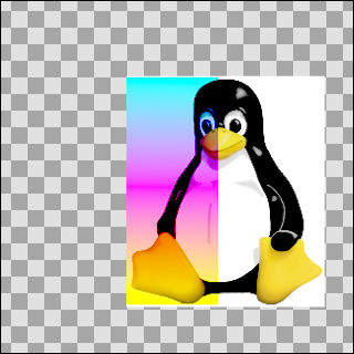
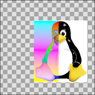
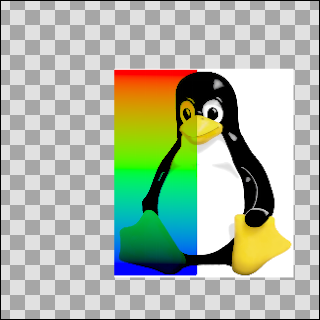
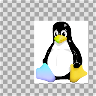
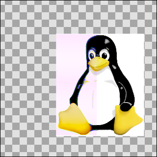
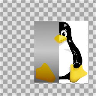
In the examples that follow a gradient (A) is blended on the image of Tux penguin (B). The transparent areas are indicated with the checkerboard pattern.
A)  & B)
& B) 
The currently available blend methods are:
Contents
Composite
This blend method is the default option, it simply displays the content of the layer. This blend mode is similar the layer blend mode Normal Mode often found in 2D programs.
Straight
This blend method looks similar to the previous one, except that the objects under a straight-object will be invisible. So if there is a more or less transparent object on the Straight mode layer, the objects on the layers underneath won't show through it.
More precisely, the resulting color is "(A-B)*amount + B". So if amount is 1 the result is A and if amount is 0 the result is B. In particular, if amount is 1 and A is a very transparent color, the resulting color will also be A; despite the fact that A is very transparent, none of B's color is used.
Onto
If a layer is set to the Onto blend method, only the parts of the layer that are over a not transparent area will be visible.
Precisely: this is the same as the Composite blend method except that the transparency of the resulting color is set to be the same as the transparency level of layer B.
Straight Onto
This method is a combination of the two methods above. E.g. if an half-transparent object is set to Straight Onto, it will only be visible over a non-transparent area, and the non-transparent part under that object won't be visible.
Precisely: the resulting color is "(X-B)*amount + B" where X is A but with its transparency set to A's transparency times B's transparency.
So if amount is 1 the result is A, but with its transparency multiplied by that of B, and if amount is 0 the result is B. In particular, if amount is 1 and A is a very transparent color, the resulting color will be a possibly more transparent version of A; despite the fact that A is very transparent, none of B's color is used in the result.
(Yuck. Are these 'precisely' comments useful?)[Yes!]
Behind
This blend method makes the layer visible over transparent areas, and invisible over non-transparent areas, giving the impression that the layer is behind the other layers. It is often used for the "Shade" effect layer, to make a drop-shadow effect.
Precisely: this is the same as the composite blend method, but with A and B swapped. B is composited onto A instead of A being composited onto B.
Screen
This blend method is similar to the Screen Mode often found in 2D programs. It combines the colors of the screen mode layer and the ones behind it, and gives a lighter result in general.
Overlay
This is similar to PhotoShop - layer blend mode Overlay Mode
Precisely: define 3 new colours: RM = A * B; RS = 1-(1-A)*(1-B); RET = A*RS + (1-A)*RM then blend RET onto B as in the Onto method above(!)
Any idea what that is aiming to do? Or what the layer does in this PhotoShop program? This appears to emulate the effect of a cross-fade between the two layers if they are set to equal amounts - i.e like 'add', but maintaining the overall brightness of the image
Hard Light
This is similar to PhotoShop - layer blend mode Hard Light Mode
For each of red, green and blue, if the component is in the top half of its range then calculate X=1-(1-(2A-1))*(1-B), otherwise calculate X=2AB, then blend X onto B as in the Onto method above.
Is this aiming to make bright colours brighter and dark colours darker?
Multiply
This is similar to PhotoShop - layer blend mode Multiply Mode
Precisely: the resulting colour is (((A*B)-B)*amount+B). The calculation is performed independently on red, green, and blue components. When amount is 0, this simplifies to B. When amount is 1 it simplifies to A*B.
Divide
Describe me
Precisely: the resulting color is (((B/A)-B)*amount)+B.
When amount is 0, this becomes simply B.
When amount is 1, this becomes B/A.
A very small quantity is added to A before dividing by it to avoid a divide-by-zero condition. This causes the divide blend method to bias toward positive values, but the effect is really negligible.
Add
Describe me
Precisely: the resulting color is (B + A*A.alpha*amount). The calculation is performed independently on red, green, and blue components. The resulting color's alpha is B.alpha.
Subtract
Describe me
Precisely: the resulting colour is (B-A). The calculation is performed independently on red, green, and blue components.
Difference
Describe me
Precisely: the resulting colour is the absolute value of (B-A). The calculation is performed independently on red, green, and blue components.
Brighten
Describe me
Precisely: for each of the red, green, and blue components, compare A's value with B's value and use the higher of the pair.
Darken
Describe me
Precisely: for each of the red, green, and blue components, compare A's value with B's value and use the lower of the pair.
Color
Describe me
Precisely: the resulting colour is obtained by adjusting B to have the same U and V values as A, while keeping Y the same.
 +
+  =
= 
As this example looks just like the saturation one, perhaps a yellow gradient instead of a white one would be more illustrative
 +
+  =
=

Hue
Describe me
Precisely: the resulting colour is obtained by adjusting B to have the same hue as A.
Saturation
Describe me
Precisely: the resulting colour is obtained by adjusting B to have the same saturation as A. Saturation is the magnitude of the UV vector.
As this example is so similar to the 'Color' blend example, here it is with a yellow gradient -
 +
+
 =
=

Luminance
Describe me
Precisely: the resulting colour is obtained by adjusting B to have the same Y (luma) value as A, while keeping U and V the same.
Alpha over
Describe me
 +
+  =
= 
